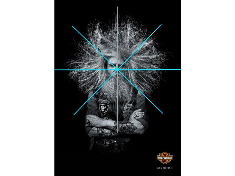
Great composition can’t fix a bad concept, but it can really improve a good one.
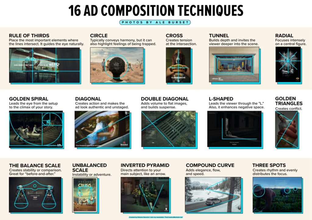
Let’s explore the techniques of Ale Burset, one of the world’s top ad photographers:
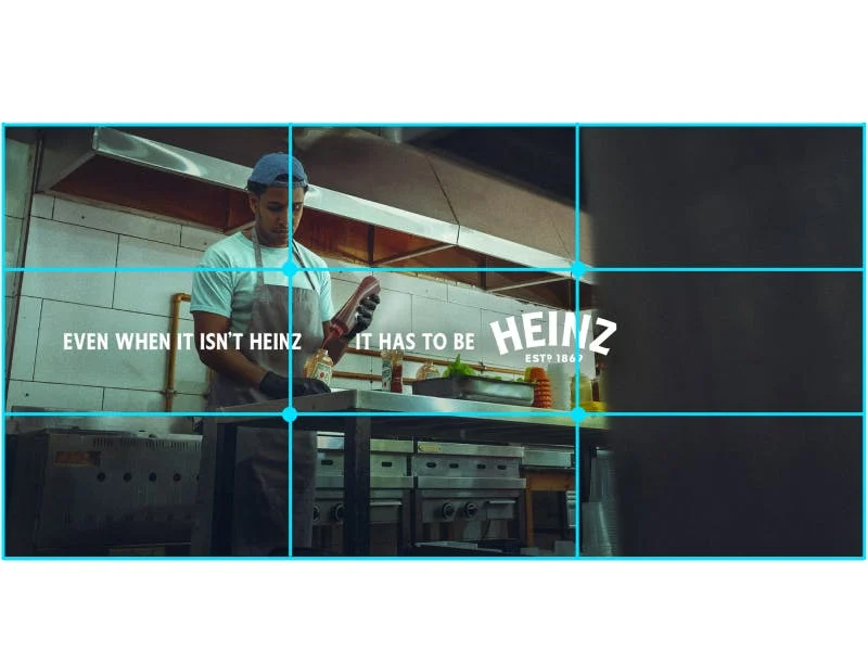
1. Rule of Thirds
Divides the frame into nine equal parts, placing the most important elements where the lines intersect. It guides the eye naturally.
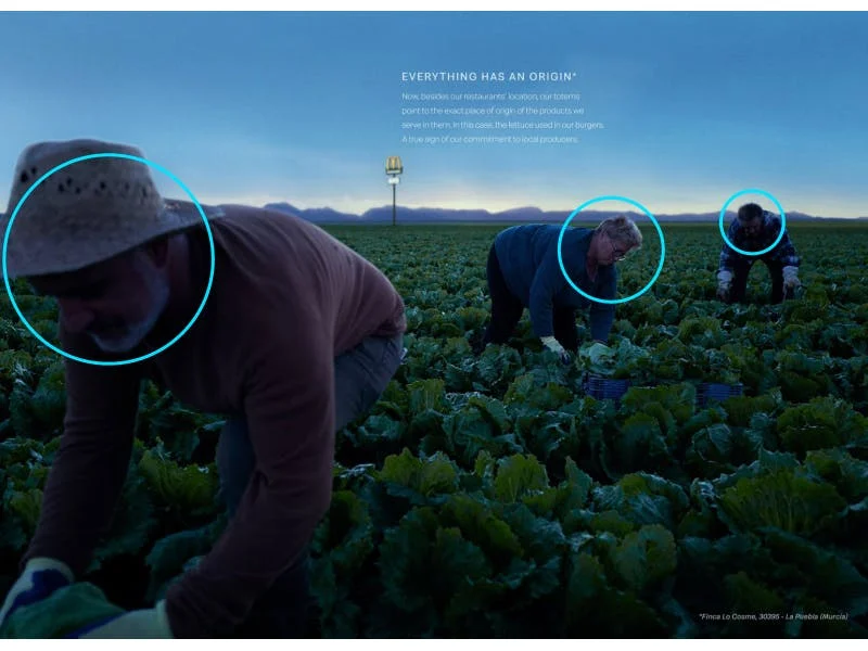
2. Circle
Typically conveys unity and harmony, but can also emphasize feelings of being trapped or surrounded.
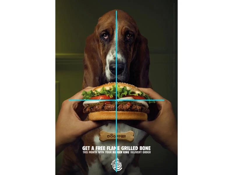
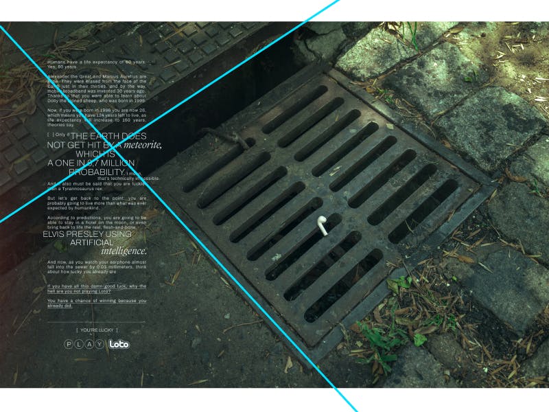
3. Cross
Creates tension and focus at the intersection.
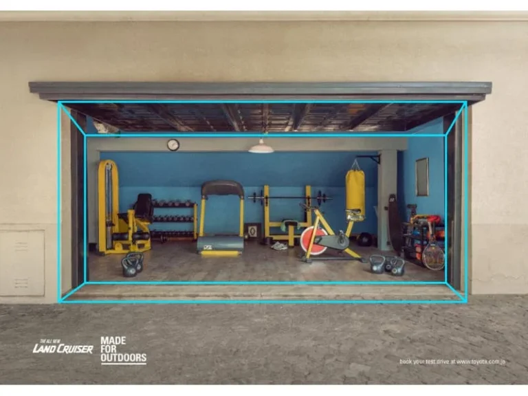
4. Tunnel
Builds depth, invites the viewer deeper into the scene.
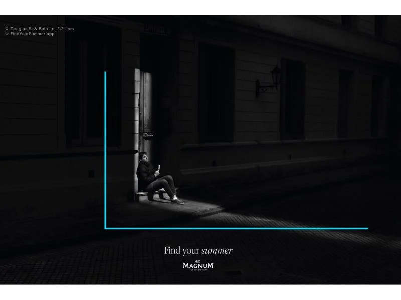
5. L-shaped
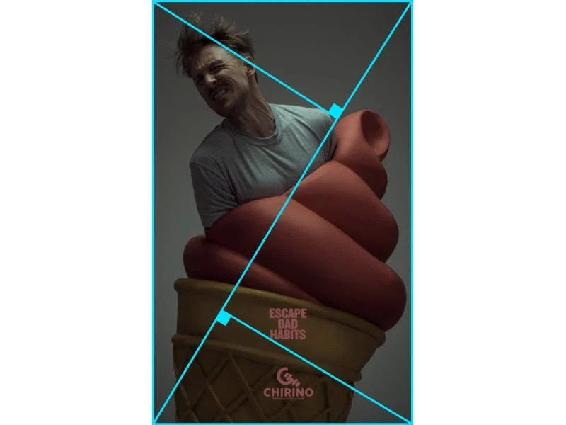
6. Golden Triangles
Balances conflicting elements. The mathematical ratio appeals to our sense of beauty.
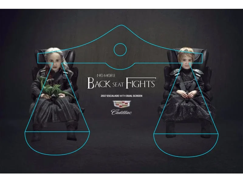
10. Balanced Scale
Creates stability or comparison. Great for before-and-after or this vs that shots.
11. Unbalanced Scale
Gives a feeling of unease or excitement. Helps reflect instability or adventure.
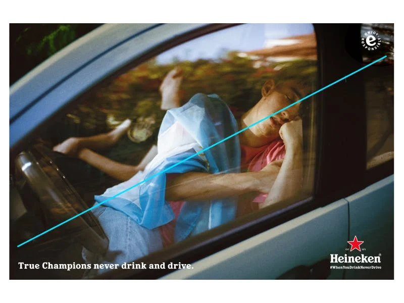
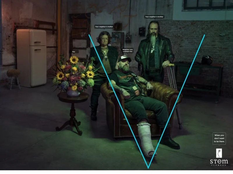
12. Inverted Pyramid
Directs attention to your main subject, like an arrow.
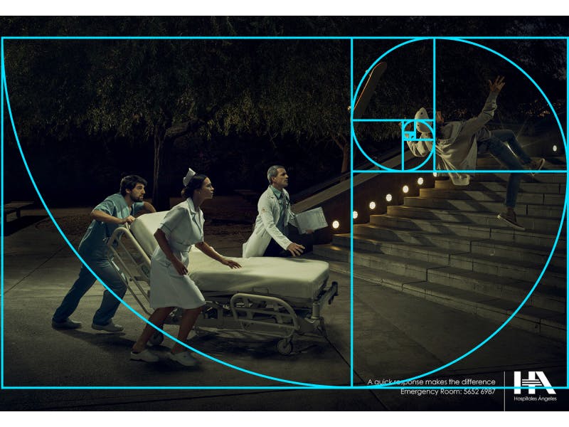
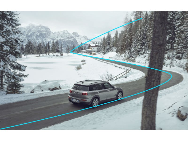
13. Compound Curve
Adds elegance, flow, and speed.
